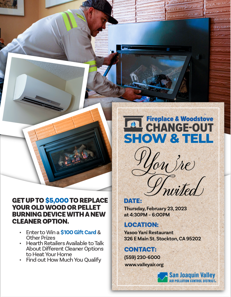
My Final design was based on the design concept of an invitation card being sent out. The idea of the design was to attract the viewer to the invitation card and read the Event Name, Date, Location, & Contact information first. Then, once their interest is peak they will look for more information and start reading the left side. The images were designed to imitate some sample photos similar to an invitation to a wedding with pictures of the hosts. This was more of a playful aspect of the Flyer of the 3 I made, one for a more pleasing-to-the-eye version with the texts in blocks of space and more of a corporate feel and another for a fluid-like feel with emphasis on flow and changing from old to new. The blue text of the Gift Card and Dollar amount will stand out from afar with its contrast to the text color and the background.
Some of the assets were color-corrected to emphasize the subject of each image more and lighten the color as it was quite dark in the original files. Some aspect of the fireplace image was extended in Photoshop to center the image in the center of the frame.
I chose the invitation-style flyer because it was something different from the usual corporate design and gives a sense of inviting and welcoming feeling to the reader who is an everyday resident. I didn’t want to make it feel like a corporate event for workers.
Below are some before and after of the assets and all 3 Designs. The Submitted version is the PDF Version.

